

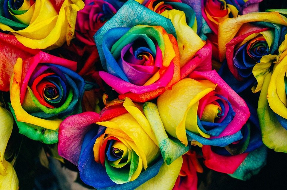
Colors- one of the most fascinating parts of science. The cone cells in our eyes allow most of us to see an array of colors. Light hits a surface, the surface absorbs some of the light and refracts other parts of the light. These colors are processed in the brain, and we assign different emotions and thoughts to these colors. Whether we realize it or not, color plays a large part in our mood and overall well-being. So what does that mean as far as signage and marketing? You want to take general thoughts and feelings people have toward certain colors, and use that as a guide on which colors would help to convey the message you’re sending out. Here’s our basic guide of colors and emotions.
White
White is generally seen as a pure color. Innocence and cleanliness come to most people’s mind when they see this color. Many times, white is used to show a clean slate, and simplicity. Be careful, however. Some people can interpret white as being boring, isolating, and empty. One of the most famous brands that thrive on using white is Apple.
 Black
Black
Black is perfect for those who are wanting to give a sophisticated vibe to their brand. While this color can give off an air of seriousness and control, it should be used in moderation. Too much black gives off the vibe of depression and sadness. Guinness is a famous brand who primarily uses black in their logo
Brown
As one could guess, brown isn’t the most appealing of colors. It does give most people the feeling of security and groundedness to the earth, though. Brown can be boring if used too often, but it can also take the place of black to scale back the intensity of a sign or logo. UPS is a great example of how using brown can work to build a trusting business.
Gold
This color is obviously seen as being opulent. Prosperity, abundance, and confidence are what most people feel when they see the color gold. As easily as this color can make something look ‘rich’, it can also quickly give an egotistical, prideful, and self-righteous vibe. Be conscious as to not go all out with this color. Two popular luxury brands who use a moderate amount of gold in their logos are Versace and Lamborghini.
Yellow
Interestingly enough, yellow is known as the least favorite color despite it’s happy, joyous vibe. Yellow also has a particularly long wavelength and is the first color that infants are able to detect. No wonder so many baby items are found in a shade of yellow. While some may find the usage of this color to be upbeat and optimistic, it can also induce anxiety and low self-esteem. One of the most recognizable logos in the world is McDonald’s, which uses the yellow ‘golden arches’ as the brand’s moniker.
Pink
Pink is commonly thought of as being a bubbly, girly color, which makes some people think immaturity when they see pink. However, pink is a great color to use when red is too intense and will give the same compassionate, loving vibe as red. The downfall of pink is that it can also be draining on one’s energy. Victoria’s Secret is arguably the most famous pink company logo.
Orange
Orange is a good color to use when yellow and red are too intense. Orange channels the energy of red, but with the fun and friendliness of yellow. Most people see orange as having a good value, being comfortable, motivated and enthusiastic. Orange is even an appetite stimulant! The most recognized company with an orange sign? Home Depot, of course.
Red
Red is a strong color that promotes energy, strength, and unfortunately, aggression. Too much red can be seen as aggressive and anxiety inducing. With Texas having some of the fastest speed limits in the country, it’s important to have an eye-grabbing Houston outdoor sign. If you’re a business near the interstate, it might be in your best interest to l ook into using red for your sign. Target and Coca-Cola are two large brands who use red for their logo and signage.
Green
Green is a great color for sparking creativity and giving a down-to-earth vibe. It’s a very relaxing color and is known to reduce stress. Use green with caution, however. It can be viewed as a materialistic, “greedy” color. Starbucks is a popular brand who uses green for their logo to give an earthy feel to their brand’s image.
Blue
As it turns out, the color blue is the most favored color in the world. It could be because of the soothing feelings people get from viewing the color. Blue is a good color if you’re looking to convey an image of responsibility, reliability, and trustworthiness. The only downfall of this power color is the fact that too much blue can give off the feeling of distance, coldness, and unfriendliness. Notice how many technology brands use blue for their logos, such as HP, Samsung, and GE.
Purple
Purple is, unfortunately, widely underused as a logo color despite the power this color possesses. The intensity of red mixed with the stability of blue makes this color a good choice. Imagination, loyalty, imagination, and mystery are generally the evoked emotions one gets from purple. The one downfall of purple is that it can lead to feelings of introspection and distraction. Yahoo and Hallmark both use purple for their logo.
Keep this color psychology guide on hand with you while creating your Houston wall sign, or Houston LED sign. If you’re having trouble deciding on which color best sums up your company, give us a call! We’ll work with you to ensure all of your Houston signage represents your company properly.